My 2023 Workspace

Inspired by the folks over at MacStories adding a new section dedicated to their setups, I figured now would be a good time to write about my own workspace. It’s actually something I’ve been meaning to write about for some time now as I’ve made several upgrades over the past year and have never been happier.

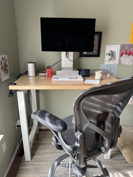
Let me start by saying that I see my workspace as an area worth investing in. That is to say while I am frugal with other things, like my car, my workspace is an area that I am willing to pay a premium for a nicer experience. In addition to using computers for my hobbies, I also work from home. This means I currently spend most of my waking life at my desk. I appreciate a nicer workspace much like someone who drives a long commute appreciates a nicer car. With that said, here is my current workplace.
Ergonomics

Standing Height 4-Leg Table by UPLIFT Desk

I currently use an Uplift Standing Table as my desk. Why a table? The best way to answer that is to talk about its predecessor and my first standing desk, the IKEA Bekant. The Bekant is a typical sit/stand adjustable desk, in that it can be raised and lowered between standing and sitting positions. You don’t have to be particularly observant to notice that the Bekant has only two legs. While I was never worried about its overall stability, I found the two-legged Bekant very slightly, but very noticeably bent with any amount of force on its surface. This bending combined with a VESA arm meant that my display would also ever so slightly bounce while typing. This bouncing was annoying the same way a slightly wobbly chair is annoying. You think it won’t bother you at first, but soon you can’t ignore it.

When I started looking at alternative standing desks, I found almost all of them also had only two legs. While it was possible, if not likely, other desks would be a bit more solid than the IKEA discount special I had grown to loathe. There was no way for me to know. Also and importantly, I never used the sitting position with the Bekant and almost all standing desks on the market are also of the sit/stand adjustable variety.

This Uplift Standing table has four legs and therefore does not bend an inch. Not being sit/stand adjustable also makes it much more affordable, so much so that I could get a much nicer birch butcher block top. I strongly prefer the feel of this butcher block to the laminate of the Bekant it replaced.

Herman Miller Aeron Stool

The reason I don’t need an adjustable standing desk is because I use a stool for my sitting needs1. My current stool is a Herman Miller Aeron, which I love. I also considered Steelcase. My wife equally loves her Gesture and while Steelcase offers it as a stool, the stool version felt like an afterthought on Steelcases’s own website2. By comparison, the Aeron Stool has been around long enough that I never worried Herman Miller might soon deny its existence. Finally, the Aeron has been the standard in office chairs for as long as I can remember. Of course it looks and feels great. I suspect there are only two kinds of people who complain about the Aeron:

  1. Those who are dealing with a decades old and poorly treated hand me down that was likely acquired by their employer in the most recent of a series of startup liquidation auctions.
  2. Those who lament that their perfection has made them too ubiquitous and thus boring. (See also: some typography nerds with Helvetica).

Peripherals

The Apple Studio Display With Tilt and Height Adjustable Stand

This could just as easily go under the “ergonomics” section above. At six feet, I would say I am on the tall side of average. I have a problem with hunching and tend to hunch even more when using a display that is only raised the typical handful of inches. This originally led me to buy a VESA arm, which raised my display significantly, up to around nine or ten inches. This was great, but it exacerbated the aforementioned bouncing issue I had with the Bekant standing desk. The Apple Studio Display with the tilt-and-height-adjustable stand, combined with an old Satechi riser has worked perfectly for my needs. While standing, the display is a whopping 13.5 inches above my desk, which I lower to 10.5 inches while sitting.

Display wise… look, no one needs a four figure 5K display, especially when there are a plethora of much cheaper non-5K displays on the market, but hear me out. The 5K iMac spoiled me, sort of like how I imagine a luxury car spoils drivers. Once you get used to that many pixels, it’s hard to go back. 4K just isn’t good enough, and you know where perfectly crisp 2x Retina arguably matters most? Text. As an engineering lead what am I staring at most of my days? Text!

My Crazy Semi-Custom Keyboard

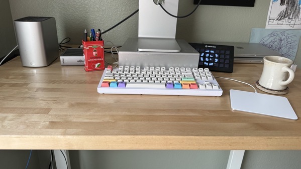
This is as much a hobby as it is a tool. Like other old Mac nerds, I imprinted on the Apple Extended Keyboard II . I still love that keyboard, but dear god is that thing an aircraft carrier on the desk. Furthermore, there has never been a better time to get into mechanical keyboards as there is currently a great community and market around them. My current build is the following:

I am not particularly picky with keyboards. I didn’t even hate the feel of the notorious butterfly keyboard on Touch Bar MacBooks, but this keyboard feels and sounds so satisfying to me that I actually look forward to typing on it3.

Apple Magic Trackpad 2

Some people still prefer a traditional mouse. I respect their choice, but can’t imagine myself going back to one outside of gaming for three reasons:

  1. Trackpads make horizontal scrolling and pinch to zoom as easy and intuitive as vertical scrolling, which is super nice when I’m editing spreadsheets or images.
  2. Using a trackpad at my desk keeps things consistent with using the trackpad built into the laptop.
  3. Scrolling the wheel on a wheel mouse always felt like something that would accelerate carpal tunnel.
AirPods Max

The AirPods Max sound great. They also have excellent noise cancellation, which I find myself using regardless of whether or not I am listening to music. Wearing noise cancelling headphones without any audio may seem ridiculous, especially for someone who works in a relatively quiet home office, but something about dulling my hearing helps me focus. Finally, their integration in Apple’s ecosystem makes them easy to use with both my work and personal laptops.

Elgato Stream Deck

The much maligned Touch Bar actually made sense once I started using it to run automations. Now that the Touch Bar is no more, I have an Elgato Stream Deck. Using it with Apple’s Shortcuts, I now have hardware buttons for some of my most common tasks, like rating music, setting common Slack statuses, joining Zoom meetings, or getting a song from my local radio station. These hardware invoked shortcuts have saved me countless minutes while removing friction.

CalDigit TS4

Being a remote worker means this workspace is shared between my work and personal laptops. Switching back and forth between the two easily is paramount. Thunderbolt docks provide a one cable solution that make sharing peripherals between multiple laptops a breeze. The dock I have been using is the CalDigit TS4. There are now a multitude of Thunderbolt docks on the market. I chose the TS4 because the CalDigit Thunderbolt 2 dock I was using before lasted me seven years and still works today. Connected to it is ethernet, a backup disk, the Studio Display, my keyboard and Magic Trackpad, and the Stream Deck, all through one cable that also charges whichever MacBook Pro is connected4.

Western Digital MyBook Raid and Nightly Time Machine

This is what I use for my Time Machine backup disk. It’s a decade old, uses Thunderbolt 2, and is connected via my dock using Apple’s pricey adaptor. Nightly Time Machine is my solution for preventing Time Machine backup disks from automatically mounting on my personal laptop until just before backing up in the middle of the night. I have separately prevented my Time Machine disk from ever mounting on my work laptop5. Functionally this means that it’s almost always safe for me to unplug my Time Machine backup disk from either laptop without getting the dreaded “disk not ejected properly” notification of shame. It also means the disks inside the MyBook aren’t spinning during waking hours, keeping my workspace free from technological hums.

Honorable Mention

Szeged Hot Hungarian Paprika Tin

A friend of mine introduced me to paprikash, a deliciously spicy Hungarian dish with noodles or rice, onions, sour cream, and chicken. The recipe calls for hot paprika, and the first company I found that offered hot paprika was Szeged. It comes in a fun tin that works great for holding writing implements.


Figuring out how to best utilize any new space has always taken me considerable time. My workspace is no different. I’ve been working from home full time for just over half a decade. While I’ve never felt uncomfortable in my various workspaces over those years, it’s taken until this year to finally settle on a workspace I truly enjoy. Tastes differ and I don’t expect anyone would enjoy this workspace as much as I do. My hope is that the items and reasoning on this list helps others find build their own perfect workspace.

Update: Added Photos of my workspace.


  1. It makes sense to me why sit/stand adjustable desks took off. They let people try standing work without committing to it. That said, adjustable desks seem a bit ridiculous given the existence of stools. Which is more elegant given someone who wants to alternate between sitting and standing at work — a complicated and expensive desk that loudly moves with everything on it over the course of many seconds or a tall chair? ↩︎

  2. Looking now, Steelcase seems to better feature the Gesture Stool. When I looked at it early this year, their configuration tool would confusingly act like I was still configuring the chair. ↩︎

  3. I am enjoying the Clickiez switches in particular. For anyone interested in going down this rabbit hole, I recommend Chyrosran22’s YouTube channel↩︎

  4. I’ll add that Thunderbolt, and Thunderbolt 4 in particular seems to be having a moment, in that it’s no longer just a Mac thing. A quick search on B&H showed just over 800 laptops with Thunderbolt 4↩︎

  5. Now that I think about it, I should also provide a script to just prevent automatic mounting. ↩︎

Fading Echoes

I spent a few minutes on Black Friday messing around with ChatGPT. Given how much I enjoy Columbo, the series of made for TV murder mysteries, I asked ChatGPT the following:

Write me the synopsis of the perfect Columbo murder mystery.

What I got in return was I think the perfect example of the power and perils of ChatGPT at this moment in time.

Title: “Fading Echoes”

Synopsis:

In the heart of New York City, renowned art gallery owner Victor Drake appears to have it all—wealth, influence, and a pristine reputation. However, beneath the façade of success, a dark secret lurks. When a celebrated artist is found dead in Drake’s gallery, seemingly the victim of a tragic accident, the enigmatic Lieutenant Columbo senses a more sinister undercurrent.

As Columbo begins his investigation, he discovers a meticulously crafted plan to cover up a premeditated murder. The artist’s death is not the result of a tragic fall but a carefully staged event designed to divert attention from a hidden motive—one that connects back to Drake’s vast empire and the cutthroat world of high-stakes art dealings.

Unraveling the layers of deception, Columbo must navigate the intricacies of the art world, decoding cryptic clues left behind like strokes on a canvas. As he engages in a battle of wits with the suave and sophisticated Victor Drake, Columbo exposes the subtle details that betray the perfect crime.

In “Fading Echoes,” the perfect Columbo murder mystery, viewers are taken on a suspenseful journey where the detective’s disarming demeanor conceals a razor-sharp intellect. As the noose tightens around the cunning killer, Columbo’s persistent questioning and unassuming charm peel away the layers of deception, revealing a motive rooted in betrayal, rivalry, and the insatiable desire for artistic acclaim.

As the truth emerges, viewers are left in awe of Columbo’s unparalleled ability to turn seemingly insignificant details into the linchpin of justice. In the end, “Fading Echoes” stands as a testament to the enduring brilliance of Lieutenant Columbo, proving that even the most meticulously executed crimes cannot escape the watchful eye of the iconic detective.

ChatGPT nailed almost every aspect of what makes a Columbo murder mystery. Almost. Like many of the detective’s foils, it made one glaring mistake that cannot be overlooked.

Columbo works in L.A.

The Pricelessness of Apple Maps

According to Walter Isaacson’s1 authorized biography, this is what Steve Jobs had to say about Apple’s lawsuit against HTC in 2011:

Our lawsuit is saying, “Google, you fucking ripped off the iPhone, wholesale ripped us off.” Grand theft. I will spend my last dying breath if I need to, and I will spend every penny of Apple’s $40 billion2 in the bank, to right this wrong. I’m going to destroy Android, because it’s a stolen product. I’m willing to go to thermonuclear war on this.

Apple settled that lawsuit two years later, in 2012, a year after Jobs had passed. While that was the year when Apple arguably got the upper-hand on Google, it was not because of this settlement or by going thermonuclear on Android. 2012 was also the year Apple eschewed Google Maps by releasing its own completely in-house mapping solution.

The version of Apple Maps released with iOS 6 in September of 2012, was summarily and unanimously reviled. Here’s what David Pogue, then at The New York Times, had to say:

In short, Maps is an appalling first release. It may be the most embarrassing, least usable piece of software Apple has ever unleashed.

The critics weren’t wrong. Apple Maps was embarrassing and unusable, so much so that Apple sent out a formal letter of apology and then fired its mobile head of software for not signing it. Software-wise, there was no justification to ship Apple Maps in 2012. Strategy-wise however, there was no justification not to ship it.

Launching its own mapping service was Apple’s biggest gambit in its war with Google, way more than any lawsuit. The lawsuits were about iPhone verses Android and while many Android device makers did borrow liberally from iPhones and iOS, it turns out Apple’s fight with Google wasn’t really about one phone platform versus the other. It was about platforms versus services, and which one might commoditize the other. Up until Apple Maps, Google had the undeniable upper hand because it was a win-win for them as long as Apple had to use its services. Google would certainly win more if everyone suddenly started using Android, but they still won even if people stuck with iOS.

Maps in particular strengthened Google’s position. Apple’s original Maps app, using Google’s backend3, shipped as one of the twelve built-in apps on the very first iPhone. More than just a key feature, Maps was table stakes. By 2012, those table stakes increasingly meant including turn-by-turn navigation, a feature Apple’s app couldn’t support under the existing agreement with Google. With that agreement expiring at the beginning of 2013, an extremely confident Google used their advantage to push for more say in Apple’s app. They were so confident in their position of strength that they were apparently caught flatfooted when Apple announced the switch to their own mapping data.

Here’s what Nick Wingfield and Claire Cain Miller had to say at the time of the switch:

One reason that it will take Google some time to build the iPhone app: it expected the app with Google’s maps to remain on the iPhone for some time, based on the contract between the two companies, and was caught off guard when Apple decided to build a new application to replace the old one.

Google did release their own maps app on iOS later that same year in December. As embarrassing as it was for Apple that the terrible state of its own mapping service left people clamoring for Google to come to the rescue, that Google did come to the rescue was a victory for Apple. It proved that Google needed iOS, and specifically its users, so much so that they gave up on what would have been a huge competitive advantage for Android. Furthermore, it meant iPhone users could still get Google Maps, replete with vector tiles and turn by turn directions, all without Apple having to concede anything to Google. Apple was then free to then iterate and improve on its abysmal service until it genuinely became good enough.

Ending a reliance on a competitor for a table stakes feature wasn’t the only strategic gain Apple got from Apple Maps. The other, arguably more valuable and definitely more lucrative benefit is how Apple Maps shifted the power dynamic with that same competitor in Apple’s favor.

One bit of information that has come out of the DOJ’s antitrust trial is that Google pays Apple 18 billion dollars a year to remain the default search provider on Safari. While that deal applies to Safari across all of Apple’s platforms, the bulk of its price is for Safari on iOS. You might be wondering why the company whose browser dominates global browser share would be willing to pay so much to be the default search provider on a browser that barely scrapes past a 20% share on a good day. The reason is that most of the 20% is people browsing Safari on their iPhones in the U.S. In fact, so many people use iPhones in the U.S. that Safari has the largest mobile browser share here. That wouldn’t matter if Google were somehow merely just a platform or browser company, but Google doesn’t make its billions on Android or Chrome. They make it on advertising powered by Google search. Google is an ad tech company and in advertising, the U.S. is king.

In summary, Google has to pay Apple billions of dollars for three reasons:

  1. Google is fundamentally an ad tech company.
  2. Most advertising revenue comes from the U.S.
  3. Safari, and not Chrome, is the dominant mobile browser in the U.S.

And there’s a fourth reason.

  1. Apple Maps

Google would not be paying billions of dollars annually to be the search default in Safari if Apple needed something equally as important from them. The only thing Apple truly ever needed from Google was mapping data. With its own mapping data, Apple no longer needs anything of significance, and so Google has to pay.

Steve Jobs talked about going thermonuclear over Android, but he was wrong. While Google did commit “grand theft”4, Android wasn’t the right battlefield and revenge is a dish best served cold. Going thermonuclear on the thief in court was never going to be satisfying. Having that same thief over a barrel and paying you billions annually just for the mere privilege to be on the platform they stole in the first place?

Priceless.

Update: It was reported right after publishing (naturally) that testimony in the Google antitrust trial revealed Google pays Apple a whopping 36 percent of all search ad revenue that comes via Safari. As John Gruber pointed out, that is even higher than the maximum 30 percent Apple takes for some purchases made through its App Store. The thief is indeed over a barrel and while that’s technically a price, I suspect some of the feelings about this arrangement remain priceless.


  1. Despite being authorized and all of the access that came with that, this biography fails on many levels. Most notably that its author, whose credibility just so happened to take a hit in recent months, blindly accepted and then recounted Bill Gates’s definitely biased statement that “the NeXT OS was never really used.” Anyone with even a passing interest in Apple history knows or could easily find out that NeXT OS is not just the foundation of Mac OS X, but also iOS. This is not a good book. If you want to learn more about Steve Jobs, I suggest Becoming Steve Jobs, by Brent Schlender and Rick Tetzeli, and Infinite Loop by Michael S. Malone is great if you want to learn more about Apple before Steve Jobs’s return in 1997. ↩︎

  2. Just imagine what he’d consider with $162 billion in the bank↩︎

  3. Apple always developed the Maps app, even when they were using Google for the mapping data. ↩︎

  4. I am sure some will quibble that Google committed grand theft, but I don’t see the counterargument. Never mind that Google’s CEO was on Apple’s board of directors at the time, just compare what Android looked like before, and then after the iPhone↩︎

The Year of the ARM Windows PC

Tom Warren, reporting for The Verge:

Nvidia and AMD are both reportedly planning to launch Arm-based CPUs for Windows-based PCs. Reuters reports that Nvidia has started designing Arm-based CPUs in what could be a major expansion of Microsoft’s Windows on Arm work. Nvidia and AMD could both be ready with PC chips as soon as 2025, according to Reuters.

I am sure 2025 will also be the year of the Linux desktop. All kidding aside, I am actually rooting for Windows on ARM for the same reasons I am rooting for cheaper 5K displays. Lower wattage ARM processors, like 5K displays, make for a better computing experience so let’s get as many people on board as possible. Unfortunately for PC folks, better CPUs is only part of the story. Windows developers are historically not nearly as keen to update their apps as Mac developers and, as far as I am aware, Windows’s ability to run software built of x86 on ARM isn’t nearly as performant as macOS’s Rosetta.

Panos Panay Out at Microsoft

Here’s the opening of Satya Nadella’s statement, as reported by The Verge

After nearly 20 years at the company, Panos Panay has decided to leave Microsoft. Panos has had an incredible impact on our products and culture as well as the broader devices ecosystem. Under Panos’ leadership, the team created the iconic Surface brand with loved products. More recently, as the leader of Windows, the team has brought amazing services and experiences to hundreds of millions with Windows 11 on innovative devices including those from our OEM partners. He will be missed, and I am personally very grateful for his many contributions over the years. Please join me in wishing him well.

I have mixed opinions on Panos Panay.

On the one hand, my sense is that he was a, if not the, driving force behind Microsoft’s Surface hardware. While not a success in marketshare, I think the Surface has been immensely important to the PC industry. In 2015, I speculated it was a “Reference Design” that the rest of the PC could follow that wasn’t just “offbrand MacBook Air“.

On the other hand, I think Panay has a track record of grossly over promising and under delivering outside of the core Surface line-up, and that these frequent missteps have been largely glossed over by the wider tech press because of his undeniable onstage presence and charisma.

Given these mixed opinions, I don’t have a sense for how much Panay was a great product leader versus an overpromising pitchman. Maybe he started out more the former, but ended up being more the later? In either case, the people I know with Microsoft Surfaces love them, and I can’t help but feel Microsoft is worse off without Panos Panay.

How to Play Mass Effect in 22 Easy Steps
  1. Launch Origin, which can’t update, log in, or reset password.
  2. Search the web, find that Origin has been rebranded to “the EA app” (I think “Origin” is a better name, but whatever.) Download and install the EA app, which requires the PC to restart. Nothing suspicious there.
  3. The newly downloaded EA app requires a password reset. Given the existing password was some weak variation of “busywork”, I suspect the previous Origin password a) had requirements that prevented it from being all that secure and b) was generally a pain to set up. No matter. The reset process here was relatively straight forward and I could use a much stronger password.
  4. Finally launch Mass Effect.
  5. The screen goes black.
  6. The screen remains black even after various keyboard shortcuts to go back to Windows.
  7. Restart the PC, which has now defaulted to 1024×768.
  8. Try to change the resolution back to 4K and Windows says it did a great job, but the it’s still 1024×768.
  9. Poke around in Windows Settings to find that HDR has been enabled. Disabled HDR and successfully changed the resolution to 4K.
  10. Launch Mass Effect again.
  11. The screen goes black again.
  12. Pull out HDMI cable and see it’s rather flimsy as well as GE branded.
  13. Try a newer HDMI cable.
  14. I CAN SEE!
  15. Audio doesn’t work.
  16. Exit to Windows. See that HDMI audio output is selected. This is good. This is what we want and yet there is no HDMI audio output.
  17. Meditate.
  18. On a lark, try switching the output to built-in audio before switching right back to HDMI audio.
  19. I CAN HEAR!
  20. Graphical glitches abound.
  21. Do the same thing with the game’s graphics settings as I did with the system audio. (It worked once already!) Toggle the resolution and HDR settings to something else before immediately changing them back to their original settings.
  22. Play Mass Effect with working graphics and sound.
The Dynamic Island’s High Floor

To my great surprise, I find myself agreeing with a take from The Verge, where Allison Johnson writes

I don’t think we’ve seen everything that the Dynamic Island can do. More apps will start using it, especially if the whole iPhone 15 lineup adopts the feature like the rumors suggest. But it’s definitely not an exciting new way to interact with your phone — it’s just a handy tool alongside some other new features that make your phone a little less annoying to use. And that’s fine.

While Marco, John, and Casey echoed the same “optimism despite limited app support” take during ATP’s exit interview, their overall tone seemed down on the feature. My thinking aligns with Allison’s. Sure the lack of app support may be disappointing, but a Dynamic Island is still way better than a static peninsula even without app support.

Adding an AirPlay 2 Receiver to the Home App

While I have switched to HomePods for other rooms in our house, they aren’t really suitable for our kitchen due to limited counter space. For that room, I have been using a traditional receiver and speakers above the cabinets. This isn’t acoustically ideal, but it works well enough. The main issue I’ve had with this setup is that my receiver didn’t support AirPlay 2. This meant it couldn’t be part of any multi-room audio and more importantly, couldn’t be automated. What I’ve long wanted is to have music already playing as I come downstairs for breakfast.1

Receivers with AirPlay 2 support have existed for years now, but they’ve been stupidly expensive given my otherwise basic needs. “Stupidly expensive” followed by “supply chain issues” kept me chugging along with my non-AirPlay 2 receiver until just this weekend, when the Denon DRA-800H went on sale for the still expensive, but not stupidly so price of $5002.

Setting up the new receiver was easy enough with the exception of one glaring problem, I could not for the life of me figure out how to add it to Apple’s Home app. The process usually involves some code, either by scanning some QR-like blob or through manual entry. This receiver did not have such code nor did it advertise itself as “Works with HomeKit”. At this point it was reasonable to assume this receiver didn’t work with HomeKit and therefore couldn’t be added to the Home app. Naturally, the Home app cannot automate a device it is unaware of. I could attempt to use a personal automation, but I have never reliably streamed music from my iPhone. Even if I could, the whole idea that I’d have to use my iPhone in a house filled with Apple TV’s and HomePods is absurd.

To say I was frustrated would be an understatement.

Eventually, I searched the web for a workaround and to my great joy, I found this post by Tim Hardwick on MacRumors. It turns out you can add any AirPlay 2 “speaker3” without the usual code by tapping “More options…” in the Add Accessory prompt. While this process was super easy once I found it, I don’t understand why it was hidden in the first place. Why can’t the Home app more prominently surface new speakers once they’ve been added to the network? Why not include the Home setup when adding the receiver to the network using iOS’s specific feature for adding speakers to the network!?

The whole rigamarole reminded me of how poor of a job Apple’s done getting AirPlay 2 adoption. To me, HomePods are like the apps that come with iOS and macOS, in that they are good enough for most people. What makes Apple’s platforms really sing is the rich set of third party solutions for customers who want to do more. AirPlay 2 should similarly be for customers who want to do more with their home audio. I think it’s close, but Apple needs to further streamline adding AirPlay 2 devices to the Home app and work with device makers to ensure that streamlined setup is better communicated to their mutual customers.


  1. Is hitting a button on a remote all that hard? No, but it’s a button I have to press almost every day and among other things, the promise of home automation is about the luxury of small conveniences. ↩︎

  2. It’s actually on sale for $400 at the time of writing in case anyone else is looking for a stereo receiver with Airplay 2 support. ↩︎

  3. HomeKit classifies receivers as speakers. ↩︎

The iPhone 11 Pro: A Four-Year Review

Time was many people, myself included, replaced their smartphone every two years and even upgrading annually wasn’t uncommon. Early new models of iPhones added significant features that greatly benefited ever customer — eponymous 3G networking, massive performance increases, and Retina displays, to name a few. As with other kinds of computers, the need to upgrade lessened as the platform matured. Right now I am using an iPhone 11 Pro, which I purchased in 2019. It’s the first iPhone I have used for four years1.

How good is this four year old iPhone 11 Pro?

This iPhone 11 Pro replaced my then three year old iPhone 72. Since there was no possible way the “Space Gray” model was ever going to look as cool as the Jet Black one it was replacing, I decided to get the silver and white model. Some tech bros frown upon white, but I always liked Apple’s white products and wanting everything in dark colors smells of toxic masculinity in the same way that wanting everything in camo does. Also this white iPhone looks amazing with the rainbow logo.

In addition to looking good, everything about the iPhone 11 Pro feels premium. The steel frame is substantive and the frosted glass back is velvety smooth. These premium materials aren’t without trade-offs. This iPhone is a bar of soap, especially when compared to the much lighter and much grippier Jet Black iPhone 7 it replaced3. Being a bar of soap means that I have dropped this phone a handful of times over the years, which is particularly scary given I don’t use a case. Neither its screen or back has ever shattered, which I attribute to both luck and the engineering involved. The biggest sign of wear is that its screen is littered with scratches that have developed over the years, the most noticeable of which happened within the first few months of usage. I don’t know if “softer glass” is a thing, but if so, this phone has it.

With some exception and outside of rare mishaps, I would describe my smartphone usage as being on the lighter side of typical. According to Screen Time, I mostly use this iPhone to listen to podcasts, surf the web, post on social media, take pictures, read email, play workout videos, and watch YouTube. After almost four years of this, I can report that I still have plenty of battery most nights after about 15 hours of being off the charger. Battery Health reports it has 89% capacity. I have noticed certain apps, Overcast and Knotwords specifically, lag upon opening. I don’t think that is related to any battery throttling as other apps seem to run just fine.

This is also my first iPhone X style model, in that it has a notched edge-to-edge OLED screen, new gestures, FaceID, and a camera system with multiple lenses. As expected, the display has amazing blacks and is great for watching videos. The new gesture based navigation came naturally to me. That said, I was blissfully unaware of OLED black smearing until using this phone. As for FaceID, I bought this phone 6 months before the start of the pandemic and while there were definitely times where I missed TouchID, I think FaceID is a huge improvement. As annoying as dealing with a mask was, that was always going to be a temporary inconvenience whereas the limitations of TouchID were everlasting. I don’t often wear a mask now in 2023, but I still do the dishes.

The camera system has held up surprisingly well. The biggest feature that tempted me in the last few years has been macro mode, introduced with the iPhone 13 Pro, but this iPhone 11 Pro supports macro photography with the help of the excellent app Halide. Halide’s macro feature isn’t some parlor trick either, and I have gotten a some very good shots with it. I have also used nightmode to great affect when capturing pictures of our adorable sleeping kiddo. Portrait mode has remained hit or miss, but regular and live mode photos come out looking reasonably good. The same is true with the videos I take. While I am genuinely excited at the prospect of taking noticeably better looking pictures and video, I don’t lament the ones I am taking today.

The camera improvements along with all of the other features I’ve forgone out of frugality these past years, like macro mode, the dynamic island, and not to mention 5G networking, is why I am upgrading to this year’s iPhone Pro 15. I am also looking to the rumored improvements coming with this year’s models, like USB-C and a presumably lighter titanium frame. That said, I don’t need a new iPhone anymore than I realistically need Thunderbolt on a phone. I am moving on from this four year old phone because I want to, not because I have to. The excellent screen, all day battery life, more than satisfactory performance and still decent cameras make for a perfectly good iPhone, even in 2023.

So how good is this four year old iPhone 11 Pro? Easily good enough to be a five year old iPhone 11 Pro.


  1. My reasons for not upgrading more frequently stem from my desire to be both frugal and zen. Upgrading an iPhone is expensive, even with trade in discounts. This iPhone 11 Pro that I paid $1,150 would have netted me around $551 had I traded it just the following year, half of what a similarly specced iPhone 12 Pro would have cost. I could have tried to maximize my discounts, but doing so requires work and I don’t need more work in my life. ↩︎

  2. My only regret with the iPhone 7 is that I decided to upgrade a year before the product redefining iPhone X. ↩︎

  3. I just looked it up, the iPhone 11 Pro is a whopping 50 grams heavier than the iPhone 7↩︎

Minimum Viable Pixels

Meta’s Quest 2 supports a resolution of 1832×1920 pixels per eye and costs $300. Sony’s VR2 headset supports a resolution 2000×2040 pixels per eye and costs $550 plus another $500 for the Playstation 5 to drive it. Apple’s upcoming Vision Pro supports more pixels than a 4K TV for each eye and will cost $3500. There is a lot more to headsets than just pixels, but I think the Vision Pro’s significantly higher resolution is worth specific examination, especially considering the displays involved are reportedly the product’s highest costing and most limited component. Apple clearly believes this display and its 23 million pixels that deliver incredibly clear text and graphics is the only one to meet what they believe is the threshold necessary to do spatial computing right.

Requiring high resolution in an immensely anticipated platform is not new to Apple. They’ve done it at least one time before and I’m not talking about the iPhone. While the iPhone was without a doubt revolutionary and had a significantly larger screen, that screen’s pixel density was actually in the ballpark of other small-screen phones of the day. Those other phones sucked by comparison for other reasons. No, the product I am referring to is the Macintosh.

The original Macintosh that was famously released in 1984 sported a 512×342 display that delivered a whopping 72 square pixels-per-inch. This meant the Macintosh could deliver incredibly clear text and graphics necessary to do a desktop graphical user interface (GUI) right. It’s why System 1.0’s design looks modern compared to other GUIs of that era and has held up for almost four decades now.

Despite its high resolution and being the first mass market personal computer with a graphical user interface, the Macintosh did not bring the graphical user interface to the masses. The reasons for this have been discussed ad nauseam. Macs weren’t compatible, were more expensive, and suffered from increasingly boneheaded leadership.

But what about Windows?

Windows was released in 1985, just a year after the Macintosh. It was compatible with millions of already sold PCs, supported cheaper hardware, and benefited from incredibly competent leadership at Microsoft. Windows was the platform that ultimately brought desktop GUIs to the masses, but not in the 80s. In fact, fewer people used Windows in the 80s than owned Macintoshes. A good illustration of this is Sim City. Sim City was a very popular game released in 1989 for both Macintosh and MS-DOS. The first Windows version didn’t appear until 1992 because no one really used Windows until the 90s. A major reason why is also illustrated by Sim City, whose 1989 MS-DOS version initially only supported the following graphic modes in MS-DOS:

EGA color graphics in both low-resolution 320×200 and high-resolution 640×350, as well as monochrome EGA 640×350, CGA 640×200, and Hercules 720×348.

Some unfamiliar with the era might look at some of those resolutions and wonder how they never noticed that PC monitors from the 80s had widescreen aspect ratios. That’s because PC monitors of the era weren’t widescreen. They had a display aspect ratio of 4:3, which was very much standard at the time. These resolutions worked not by making the displays wide, but by making the pixels tall. Most PCs sold in the 80s primarily measured their displays in lines and columns. Pixels obviously existed, but only in the context of rendering command line interfaces.

Arguably, Windows biggest advantage in the 80s was that it made multitasking between different programs much easier. Even though Microsoft managed to pull this off in software, the hardware limitations of low resolution CGA and EGA graphics with chonky rectangular pixels made multitasking clunky to the point of being unusable. I don’t have the statistics to prove this, but I would bet good money that the rise of Windows 3.x correlates very heavily with the adoption of VGA’s 640×480 graphics mode and SVGA. SVGA in particular delivered 800×600 resolution that roughly amounts to 72 square pixels per inch on a 14″ display, a size that I recall was fairly common in the early-to-mid-90s. Not only that, but I would also wager heavily that Windows 95, which started development in 1992 and included an overhauled GUI that just so happened to drop support for anything less than VGA, was a massive success because it was the first version of Windows that was really designed for the 72 PPI threshold.

The Macintosh illustrated the importance of 72 PPI because of how its GUI didn’t need to change. Windows illustrated the importance of 72 PPI because of how much it did change.

Many people have and will instinctively compare Apple Vision to the iPhone, iPad, and Apple Watch, but those were mass market devices from day one and priced accordingly. The Vision Pro is not a mass market device. The closest thing I can compare it to is the Macintosh, and the only thing I can compare spatial computing to is desktop computing. Desktop computing took a decade to come to the masses. It may not take a decade for spatial computing and I am sure Meta and Sony will continue to sell many headsets in the intervening time. I am also confident that every headset will inevitably exceed this new threshold set by Apple, just as PCs eventually exceeded 72 PPI, but I would bet that any headset that isn’t just a video game console will offer an experience closer to Vision OS than anything else on the market today.