
While previewing Windows 8 at its Build conference, Microsoft placed a lot of focus on consistency within the new Metro UI. Jensen Harris made this statement about title positioning during his 8 traits of great Metro style apps presentation:
The title [is] spaced the exact same amount from the upper left.
He then showed the following slide to further illustrate his point: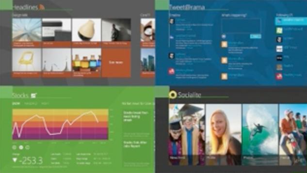
This is a marvelous visual aid except for one problem: the green boxes do not accurately represent consistent title spacing. Most obvious is how “Socialite” sinks below the green guide. While this could have been a simple illusion brought on by heavy compression, a quick google image search reveals inconsistent title spacing throughout the interface.
Assuming that design consistency was a known focus for this conference, why didn’t Microsoft clean up their own UI before demoing? Less ideally, why not simply show templates without bringing attention to their own apparent lack of detail?
Microsoft looks to have made huge design improvements with Metro, but demanding consistency while blatantly ignoring it themselves is like a restaurant manager who doesn’t wash his hands before leaving the restroom.